Great architecture serves people by placing them within a beautiful reality.
Auth Deco is a manifesto on how to achieve this goal, defining a method and purpose for design rather than a particular architectural style. The name hearkens to Art Deco, or arts décoratifs, the last bold style of an ascendant, optimistic civilization before post-war nihilism turned our gaze downward.


Some day Art Deco may return as the style of exuberant dominance. But until then, the rest of us need principles suitable for an ascending civilization or a declining one, principles are that are scale-, cost-, and context-invariant, equally suited for a villa, town square, or starter home.
Auth Deco structures tell a good, internally consistent story within realist bounds. They maintain internal authenticity and respect external authority for good reason.
INTERNAL AUTHENTICITY
Choose a story for a building and stick with it. By story, I simply mean the narrative you aim to communicate with the structure, the conclusion to the sentence:
“This building is _____.”
The story might be selected from a particular architectural tradition (e.g. a Federal townhouse), dictated by site constraints (e.g. a restoration of said townhouse), or serve a simple practical need (e.g. to raise a family). But it must ring true as a bell throughout the structure.
Why?
People are miraculously good at pattern recognition. They can be totally ignorant of a particular architectural tradition and yet observe that a culpable builder also knows nothing of the style. Inconsistent structures create the same horrible outcome as the uncanny valley in robotics.


I see the Terminator, easily categorize it as an evil robot, and look for a weapon to fight it. I see Joe Rogan and recognize he is a human: I’m ready for a podcast. But the blob in the middle is disgusting. By pretending to be a human and subtly failing, this robot places itself in an uncomfortable valley between clear categories. I don’t know what it is for or what it can do, but I am certain it is not a person. This robot fills one with a visceral hatred — can you feel it?
Most current architecture resides in this uncanny valley.
The problem is not that builders reach too high or settle for too little. The problem is that they don’t know how to tell a consistent story. Their ahistorical constructions are grab-bags of half-hearted grandiosities rather than simple unified stories. For a catalog of these follies, I recommend McMansion Hell, and The Timeless Way of Building explains how a culture forgets to read or write its own design language. For the moment one example is enough. The first building below possesses a unifying quality the second lacks.


But what is it? How can we remember how to build well again?
Authentic Materials
This is the most obvious but troublesome tenet of Auth Deco. Authentic materials put the observer at ease because they are at ease: there is no artifice to discover. Fake materials, on the other hand, create tension between what is, and what is asked to be perceived. In other words, inauthentic materials make a structure functionally trans.
You must call me “travertine,” proclaimed the printed ceramic tile.
“Walnut stain is real walnut,” said the yellow pine trim with a thick brown coat of paint.
This principle is easier to accept once one recognizes that — as in the current trans epidemic — few fall for the artifice: they merely hold their tongues out of courtesy.
There is absolutely nothing wrong with low-cost or artificial materials. Just be honest about it. Formica is great, until it pretends to be marble. Concrete is wonderful, until it pretends to be stone.


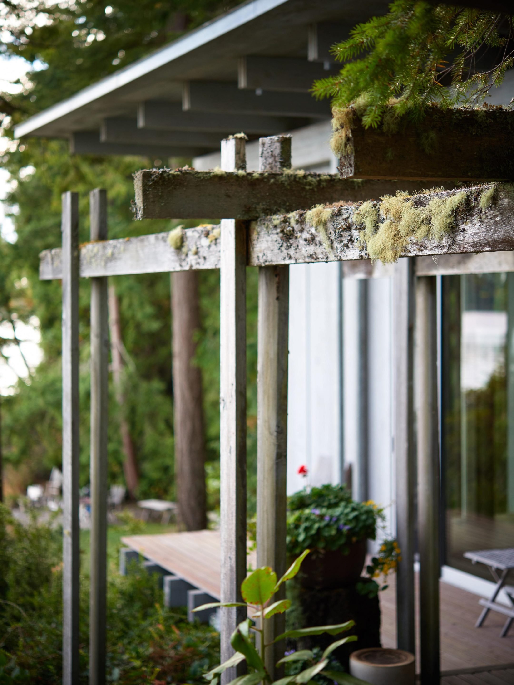
Auth Deco take the principle of self-consistency a step further: materials are most authentic when they provide a consistent texture across space, time, and scale. They must age gracefully or not at all.
Some materials are basically flawless and eternal: gold, thermal spray chrome, PVD diamond-like coatings, well-placed glass, etc. If you have the means, I highly recommend picking them up. Unless restoring or replicating traditional styles, avoid sentimental attachments to old bad materials when new good materials are an option.


But most materials age, so we are faced with a more practical question: given the inevitability of wear, which materials will gracefully wear in rather than out, developing a patina rather than failing?
Here is a simple guide:
Use solid materials rather than thin veneers where possible (the simplest defense against the slings and arrows of outrageous fortune).
Scale the finish texture to be comparable to the scale of distortion and wear expected to occur over the material’s lifespan in order to accept that wear pleasantly. Glass mirrors ought to be perfectly smooth, but specifying a mirror finish on a wood floor is asking for trouble.
Use self-healing, in-situ, or penetrating finishes rather than distinct finish layers. As noted by Newton (p. 250 of Opticks), penetrating finishes bring out a material’s colors better by matching its index of refraction. These finishes also tend not to bubble and delaminate in separate layers as they age and are easier to reapply.
Most materials following these rules will maintain or improve their character as they age.


Note that this not an absolutist insistence on solidity, though: large buildings are often clad in granite or similar veneers, and nobody ought to think that the building is pretending to be carved from a solid block of granite. Here the non-structural stone veneer communicates a beautiful, long-lived surface rather than claiming to be solid masonry construction — perfectly authentic.

Russ Building, my favorite neo-Gothic tower in San Francisco. While the building has a terra-cotta facade, the structure is obviously steel and not clay!
In summary, let every material represent its own nature honestly so users can focus on the story instead of tip-toeing around narrative artifice.
FLUENCY IN THE WORLD OF Forms
Time attacks more than building materials. It is the universal solvent, and only the forms valued enough to be restored and reproduced can survive it. Thus time purifies all novelties until only the most powerful and true forms stand unbroken through their generations.
Understanding this is necessary to design well. Rather than build a lifetime of mediocre work starting from nothing, use the forms purified by others’ efforts. As obvious as this seems, there are architecture schools, architects, and builders that do not seriously consider their own history. To be fair, the world of forms has many pattern languages and dialects that fill many volumes (a few favorites are listed below). We can only hope to master a few dialects by studying specific designers and structures.
Knowledge of timeless forms does not eliminate originality and individual spirit. Some of the best architectural works are truly revolutionary, and we can only imagine what Brunelleschi would build today. Rather than inventing clever interlocking brick patterns to build the world’s largest freestanding masonry dome, he would find another way to break new ground.


But before stepping off the path created by one’s architectural forebears, one ought to be able to locate that path and explain why the departure is necessary!
Let’s take these principles from a monumental scale to single-family homes to highlight why design fluency is so important. Consider the following well-known pattern languages and how easily the harmony of a design can be destroyed by a single misplaced element.
Midcentury Modern — this language speaks in industrial, functional, un-ornamented, minimalist geometry and materials. One nature-patterned stained glass transom window drawn from a Craftsman-era catalog would be enough to throw the design into confusion. Did grandma break a window and replace it while the owner was out?


Functional farmhouse — this is a vernacular, practical pattern designed for raising a big family. The craftsman window above and the underdeveloped window casing below would be perfectly at home here, but an Ionic column would not. These are houses for farmers, not bankers! Even Jefferson’s Monticello used the less ornate Tuscan order.


Victorian townhouse — these houses were built by architects and builders familiar with the Classical Orders (a system of proportions for perceptually load-bearing design elements), and they got 200% of the details right (note several Ionic capitals). Under-develop a window casing with flat stock, on the other hand, and the would-be Victorian degrades to a Contractor’s Special instead.


Victorian townhouses, farmhouses and midcentury modern showpieces all draw from well-known pattern languages. Each of these pattern languages can be used to create a harmonious message when made from real materials and fluently selected forms.
But internal consistency and authenticity is not enough to create a great building. Some design languages generate great buildings — even when applied by those with little talent. Some traditions tend to produce ugly, unusable, uncomfortable structures — even when the architect is brilliant.
Why?
RESPECT FOR AUTHORITY
Auth Deco includes no explicit mandate to follow a specific architectural tradition, but it implicitly ranks pattern languages by their ability to respect external authority.
Architects may be proud, but they are no gods.
Auth Deco designs accept the boundaries created by higher authorities:
physics — how a structure interacts with light, air, water, heat, gravity, and time
psychology —the structure’s effect on observers and users
economics — the financial limits and justifications for a design
context —the surrounding environment, including neighbors, local code, and site history
Christopher Alexander’s A Pattern Language is a great introduction on many of these external constraints, explaining exactly what goes wrong when they are not respected. But rather than attempting to summarize all 253 rules in that work, consider modernism — an architectural school not known for humility — and a few rules modernist structures often disrespect.
Great Modern Architecture?
Modernist architects explicitly reject tradition and authority.
It is not possible to go forward while looking back.
— Ludwig Mies van der RoheThe intellectual bourgeois of the old Empire — tepid and unimaginative, mentally slow, arrogant, and incorrectly trained — has proven his incapacity to be the bearer of German culture. His benumbed world is now toppled, its spirit is overthrown, and is in the midst of being recast into a new mold.
— Walter GropiusArchitecture is the will of an epoch translated into space.
— Ludwig Mies van der RoheWe must forget the prewar time, which was totally different. The sooner we adjust ourselves to the new, changed world, to its new, albeit harsh, beauties, the sooner will each individual be able to find his own personal happiness. The distress of Germany will spiritualize and deepen us.
— Walter Gropius
This search for new forms did result in real art sometimes.

Ludwig Mies van der Rohe’s Farnsworth House, possibly the most famous house in the International Style, completed 1951 in Plano, Illinois. Hereafter, the Farnsworth House
The Farnsworth House is classic modernist architecture, with good proportions and clean details. Mies van der Rohe also designed well-known modernist furniture like the Barcelona chair below.


Barcelona chairs are a staple in fashionable offices everywhere, but it takes a moment sitting in one to notice that they are uncomfortable, and a chair must be comfortable to be a great chair!
Unfortunately, modernist structures have similar problems. While they might sometimes qualify as art, they are usually bad buildings. Here are a few big flaws with Farnsworth House and other modernist buildings.
Gravity
Structures must stand. This is an engineering problem. Structures also must look stable to support human flourishing rather than discomfort — even the wordcels among us have an internal physics engine that will throw a red flag at unstable-looking structures. This is a design problem.
Perceived stability is provided by visible load-bearing elements in reasonable configurations which appear to transfer load downward. Masonry arches loaded in compression are reasonable. Large beams are reasonable. Missing beams and spindly columns supporting large masses are not.


Modernist buildings are often purposeful paradoxes. The building on the right presents the viewer with a puzzle: what is holding up the second floor? Surely not glass. Is the concrete floor entirely cantilevered? Seems too thin! I think there is a concrete column in the corner of the first floor wall, but why not simply tell the user how it works with better design elements?

At least the Farnsworth House avoids this mistake: the large regularly spaced columns communicate structural soundness clearly.
Light
One can predict exactly how the sun will interact with a structure long before construction begins. People are phototropic: they naturally seek light, and views of nature are calming. Yet we need privacy and a sense of security, and have relatively narrow comfortable temperature ranges. A structure and its glazing must be oriented in careful consideration of the sun, the climate, the views, and of course, the neighbors. If you can’t visualize the interaction between the Earth’s 23.4° axial tilt, the structure’s latitude, and the time of year, there are now great apps that can help.
Modernist architects often ignore all of these points and sheathe the building in a uniform glass facade. These buildings are only habitable due to hard-working mechanical systems compensating for this design.

The Seagram Building by Mies van der Rohe et al.
Try to work in a skyscraper on a Saturday when the HVAC is disabled and you will quickly discover the severity of the problem.
The Farnsworth house has the same issue on a smaller scale. The long east-west axis matches Rule 128 of A Pattern Language for better light and heat managment, and the massive single-pane glazing enables great views of the surrounding forest. But the all-glass approach eliminates privacy and — especially without a sheltering roof overhang to the south or a reduction in glazed area to the north — creates intolerable temperature swings. This makes the house practically unusable for much of the year.

Farnsworth House, north and south elevations
Water
We know how water works. It is certainly possible to design roofs, windows, and walls that withstand water successfully and it has been for centuries (tip: highly vapor permeable, inorganic, porous substances like lime plaster are currently under-appreciated). Water in unexpected places is the architectural nemesis. Rooflines and detailing that invite water intrusion are architectural sandcastles making a pointless last stand.
And yet modernist buildings are famous for their water issues.

Westhope by Frank Lloyd Wright
“This is what happens when you leave a work of art out in the rain”
— Frank Lloyd Wright’s sister, on the habitually leaking roofs at Westhope
Back to the Farnsworth House: while the roof is flat, the roof detailing seems pretty good.

Unfortunately a leaking roof is low on the list of concerns because the house frequently floods. Mies van der Rohe knew he was building in a floodplain, but insisted on this location for aesthetic reasons and sought to mitigate water issues by raising the building five feet above grade. The floating effect this creates was beautiful, but he did not have sufficient respect for the elements in locating the structure.

Air
The effects of air quality on occupant health are becoming clearer. Given the tight air envelopes required by modern code, healthy buildings are only possible with a temperate climate where windows can remain open or additional ventilation systems can cycle fresh air. In practice, this means installing an HRV or ERV system to cycle stale indoor air with fresh outdoor air while preserving the correct temperature and humidity.

Air monitoring tools like Awair provide great insights (in this case showing the effect of opening a wood stove door on indoor air)
The Farnsworth House has only two operable windows and no cooling system, giving occupants little control over temperature during hot Illinois summers (in winter the energy bills were very high due to the single-pane glass).
Fire
In most climates, heating is both a comfort and a seasonal necessity. Ensure the structure can be climate-controlled effectively, and if possible find a way to include a visible hearth and flame.
The Farnsworth House included a novel in-floor heating system but it was undersized. It also included a fireplace — even the most minimalist aesthetes recognize the beauty of a dancing flame — but the fireplace was poorly designed, made of unsuitable materials, and did not draft correctly (mistakes that can be avoided by those with the humility to study prior art on fireplaces).

The Farnsworth house resulted in a bitter lawsuit due to its flaws — and this was high modernism!
Average Modern Architecture
If modernism causes the greats to stumble, what will it do to the rest of us? Here are two local modernist structures with questionable rooflines.


Even given incredible budgets, modernist structures often struggle.

1006 Chantilly Rd, Los Angeles: a ~$10mm mansion built in 2016. Hereafter, the LA house. It’s loosely modern in the sense that it purposefully breaks prior architectural traditions.
This LA house looks impressive on first glance. The front entrance aims for grandiosity, but the material selection and the anti-human design are disconcerting.


Glass is a dumb material for bridges. It is cracked in many places and provides little traction. While the design includes plenty of shin-slicingly sharp edges and hard surfaces, it also neglects to provide a handrail. Is this innovation perfectly calibrated to keep out tipsy burglars on rainy nights, or is it simply architectural hubris? You decide.
On the inside, materials are chosen for shock value rather than suitability, and the modern insistence on removing trim results in ugly junctions where the “perfect” design meets the real world.


Everything here is bad: the “fireplace” is fake and overwhelmed by a flatscreen. The zero-clearance, trim-free detailing results in gaps, chips, and squashed features. The stone fireplace surround does not cast even a vague allusion to solidity, and the inside is even backlit by blue-tinted LEDs.
The modernist motive is antithetical to Auth Deco: novelty is a poor destination, rejection of tradition a blind guide.
Even modernist architects recognize that there is another way.
Where can we find greater structural clarity than in the wooden buildings of the old. Where else can we find such unity of material, construction and form? Here the wisdom of whole generations is stored. What feelings for material and what power of expression there is in these buildings! What warmth and beauty they have! They seem to be echoes of old songs.
— Mies van der Rohe
Yes, there is a time for glass walls, steel beams, sweeping concrete curves, and minimal forms drawn from the modernist pattern language: only when these patterns respect the context of the building and serve users well!
Pursuit of the Good
Architecture matters because it serves man. Man matters because he is created Imago Dei; of all creation, he is the most like God, with the capacity for nobility and greatness unlike other creatures.
Auth Deco structures tell a good, internally consistent story within realist bounds in order to inspire Man to be internally consistent, accept reality, and pursue good. Destroy the link to God, and there is no direction toward which architecture ought to push us. If we are no more than machine, then Bauhaus is as good it gets! Sorry.

Paperclip-maximizing ideology: no AI required
But there are design languages far worse than functionalism. Some architects do not just reject authority, they sacrifice functionality to spite authority.
The Royal Ontario Museum below is arresting. Why? Simply put, it broadcasts civilizational suicide.

The Michael Lee-Chin Crystal at the Royal Ontario Museum
The message here is crystal clear: we had a beautiful pattern language for constructing functional public buildings. But that tradition is being consumed by a cancer of dysfunctional, formless, hostile geometry. Praise this death!
To which we say no.
Auth Deco buildings are buildings of hope for people.
You visit the earth and water it,
You greatly enrich it;
The river of God is full of water;
You provide their grain,
For so You have prepared it.
You water its ridges abundantly,
You settle its furrows;
You make it soft with showers,
You bless its growth.You crown the year with Your goodness,
And Your paths drip with abundance.
They drop on the pastures of the wilderness,
And the little hills rejoice on every side.
The pastures are clothed with flocks;
The valleys also are covered with grain;
They shout for joy, they also sing.
Psalm 65:9-13
Participants in Auth Deco architecture should feel uplifted, grateful, and alive. Challenged to be better. They should feel the scented breeze, set their eye on the horizon, and begin a great work.

Post-script
Auth Deco is more than an idle theory. Many structures are built in accordance with these principles, and I used them to build a house myself, which will be the subject of a future post. Until then,
Connect on Twitter
Sell me properties in Coeur d’Alene on which you want to see Auth Deco structures built
Browse some of my favorite structures and references on architectural theory below
Designing a New Old Home
This series of blog posts by Simon Sarris highlights common problems with “Millennium Mansion” style architecture and chronicles his construction of a relatively traditional Colonial house. Simon’s work inspired me to dive further into architecture.


Olson Kundig
This architecture firm based in Seattle creates modern structures generally consistent with Auth Deco principles. You might be surprised to see modern construction praised, but the elevated, expansive ruggedness, the raw, authentic materials, and the visible mechanisms are all great. I appreciate most of their work despite some thermal management issues.


Fairfield Carmelites
This monastery in Pennsylvania is built on the premise that everything must last for a thousand years. The character of these buildings ought to communicate the character of God. That means most modern building materials are unsuitable, and almost everything in these buildings is built from a subdued palette of stone, lime, timber, and tung oil. The results are simple but real.


Building culture
This team of designers and builders based in Oklahoma creates solid masonry homes, and their twitter account is worth a follow. Just like the monastery above, the authentic, solid nature of these structures creates an environment that “cultured stone” veneers cannot mimic.


McMansion Hell
Kate Wagner’s blog provides ruthless, hilarious commentary on modern building foibles. I crack up reading these posts and love the terms like Lawyer Foyer, Pringles Can of Shame, etc. She writes from an anti-capitalist perspective, but this is understandable based on the garbage she sees.

A Pattern Language
Christopher Alexander’s masterpiece on a humanist philosophy of architecture starts with the structure of civilizations and ends with sizing trim and arranging mementos on your countertop. Reading this book was a quasi-religious experience because I found the author articulating many principles across many scales that I had previously felt only imprecisely.

His The Timeless Way of Building is also wonderful. Both books sometimes dwell in architectural idealism where a practical but imperfect solution would be more useful to the reader. But if you follow the rules in this book, your structure — unlike most built today — will live.
Get Your House Right: Architectural Elements to Use and Avoid
While Alexander’s book is a philosophical treatise on the why of architecture demanding intuitive understanding, this book is a prescriptive manual on what to do. Why? Because three millennia of architects (notably including His Royal Highness, King Charles) tell you to do it this way, idiot.
This is an excellent antidote for Alexander’s free spirited approach and all of the demands in this book seem correct. You will find yourself treating some of them as suggestions, of course, but informed deviation from the prescribed path is wiser than uninformed wandering.


A Field Guide to American Houses: The Definitive Guide to Identifying and Understanding America's Domestic Architecture
This is a picture book, and a very fun one at that. Once you’ve had your fill of architectural theory, you can breeze through the introductions to each style and see how architectural rules are put into practice across more great buildings than a casual observer will see in a lifetime. The glaring flaw in this book is that it includes no interiors (most photos appear to be taken from a street or public walkway), but that would have made the collection effort far more difficult so it’s an understandable omission.


X
These accounts on X are worth a follow for other architecture and civic perspectives: